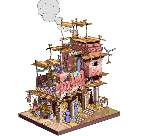
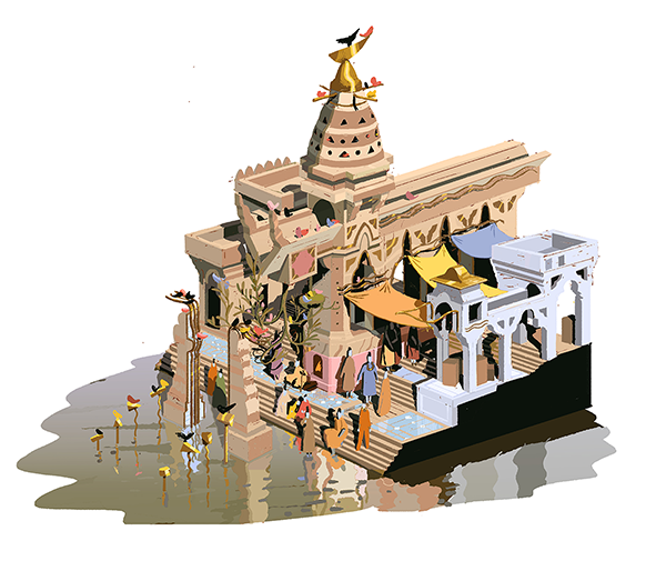
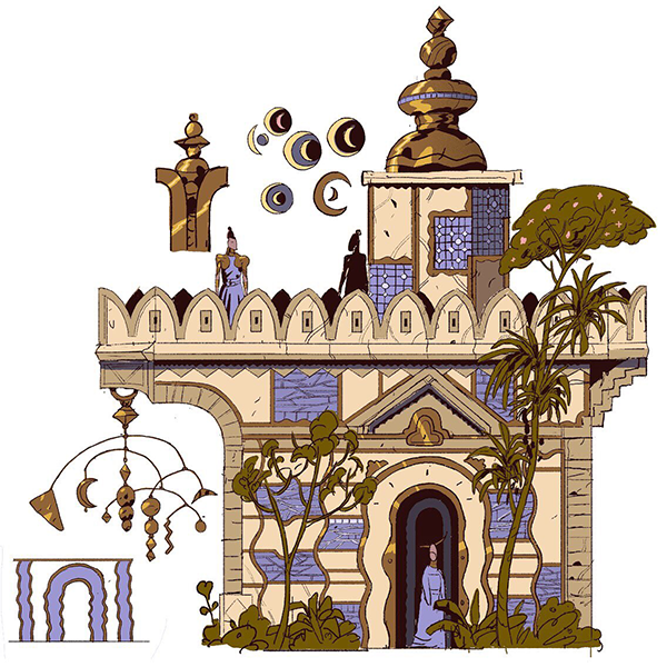
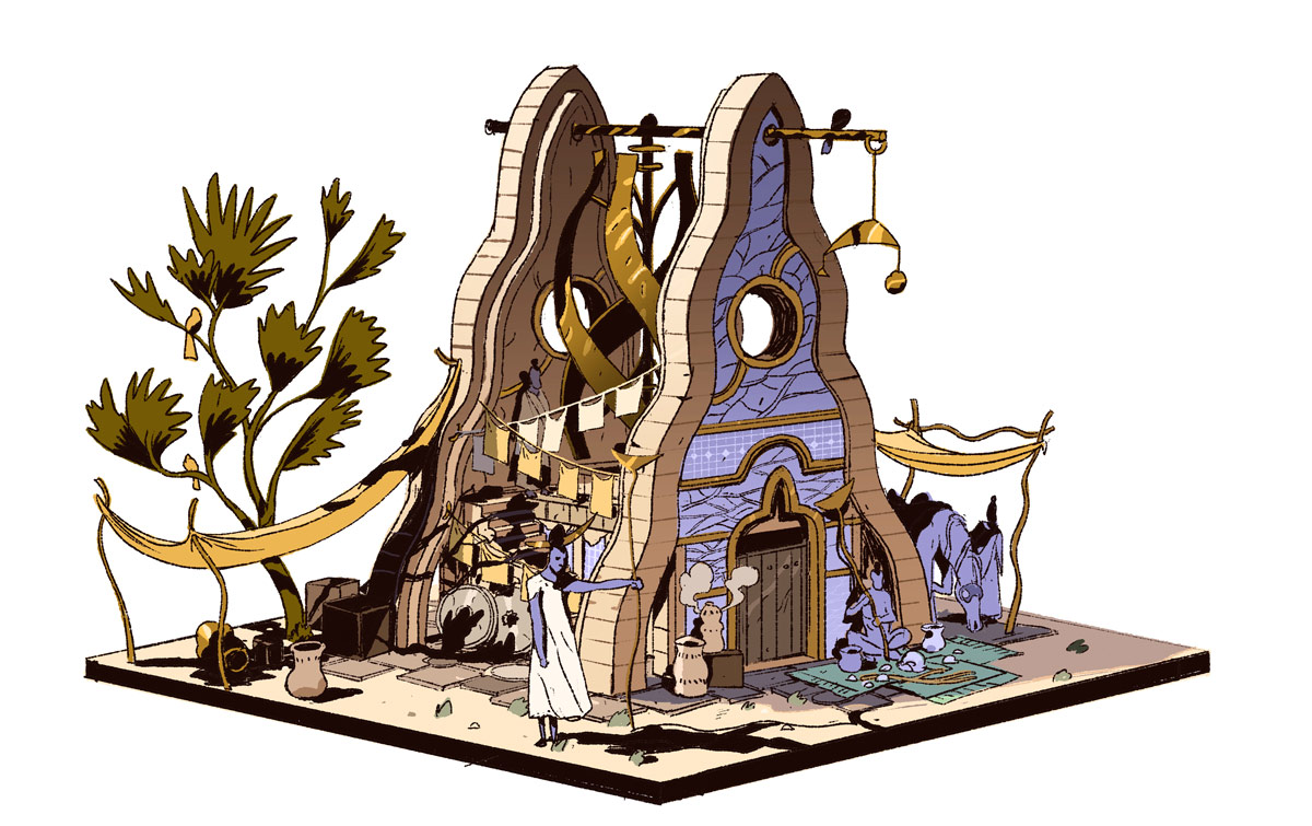
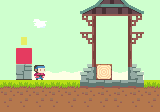
Development on Miegakure is going well.
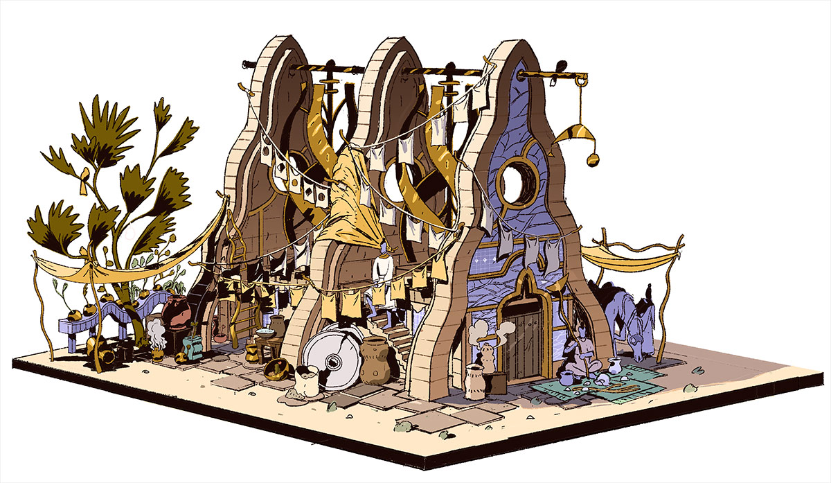
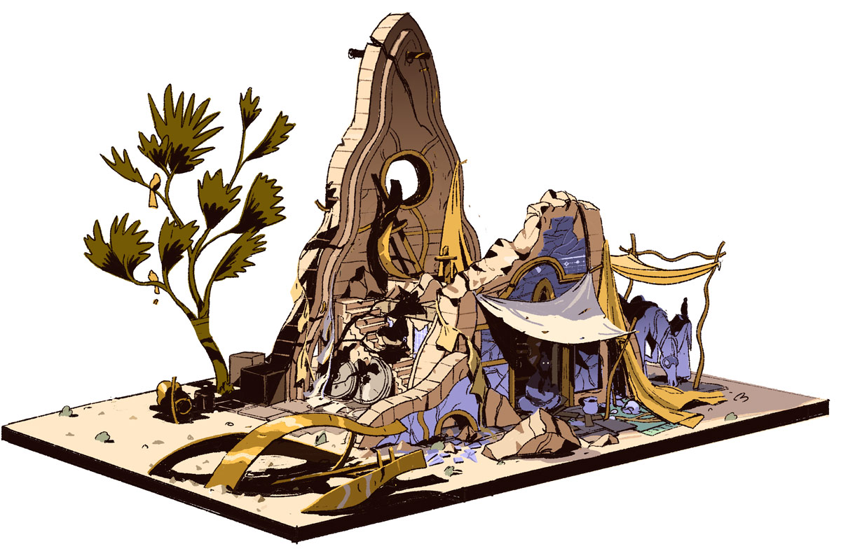
Modeling the large buildings is very far along and will be done soon.
I polished many things across the entire game.
In July I recorded my SIGGRAPH 2020 Talk about my Technical Paper on n-Dimensional rigid body dynamics, and will post it publicly soon.
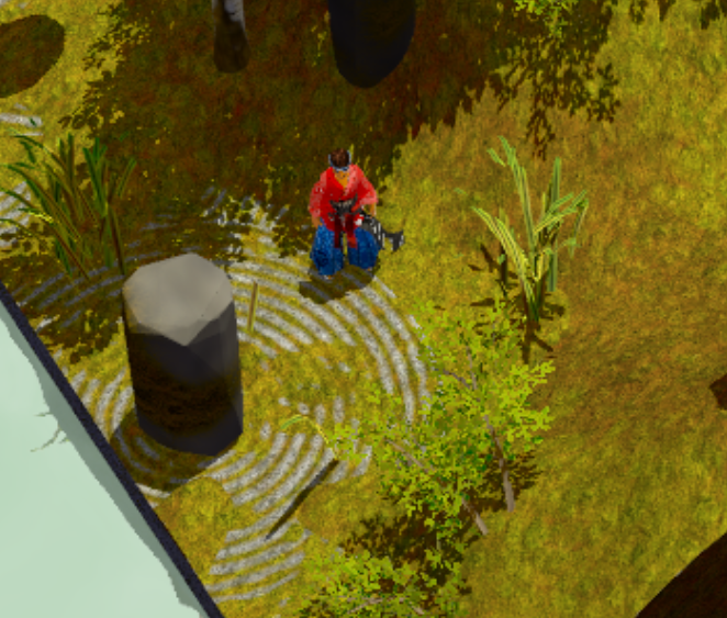
I started working with a new artist to *really* nail down the final look of the game and environments across the whole game in a more integrated way. In the process we finally fully switched the engine to Physically Based Rendering (It was an easy switch, actually, contrary to what could be expected!)… and it makes the game look even better.
These were my thoughts as we nailed down the look of the game, and about how 4D space constrains our art direction in Miegakure:
In Miegakure we procedurally generate many 4D meshes and 3D textures. Just like 3D objects have a surface that is 2D, 4D objects have a surface that is 3D! The game also has many regular 3D meshes (with 2D textures) which are embedded in the 4D world, by giving them 4D thickness.
At first it might seem difficult to generate procedural 3D textures which are as detailed as 2D ones made by hand. And we need both at the same time!
In order to have details that aren’t noisy during transition, for a while I was using a combination of a 2D texture and a 3D texture, where the 2D texture contained more detail but was not affected by the slicing, and was just projected onto the sliced object’s surface. This was a hack, which you can see in the trailers: the high frequency detail of the texture just either slides or streches.
However too much 3D texture detail looks bad during the “transition” anyway. (The transition is what I call the time when the slice rotates 90 degrees after you press the 4D rotate button.) If the slice goes through many tiny objects as it rotates, the time each tiny object will be visible will be very short. This would look like many appearing/disappearing objects. The smaller the objects, the quicker they will be appearing/disappearing. In this video of an MRI of a fruit, the tiny seeds look noisier than the larger overall shape as the slice changes (but the colors are all grayscale and the size is still fairly big so it doesn’t look bad). So if a 3D texture has too much small detail, even if it looks good as a static 2D slice, it will look very noisy during the transition. So actually we don’t want to generate too much 3D texture detail, even if we can!
By the way there is a noise issue in 3D too: when the 3D camera moves over quickly changing detail it can create aliasing (a “shimmering” effect). Much of our 3D handmade content (large buildings, trees…) was already made to be less noisy in that sense. Stylized games have an easier time avoiding this problem since they often contain large flat regions of color.
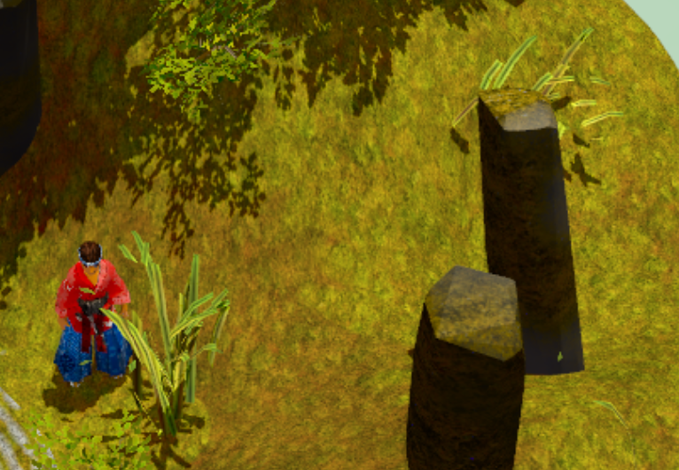
Also, note that we can replace texture detail by geometric detail. This is part of what happened in the games industry with the transition to Physically-Based Rendering. Textures in PBR are not supposed to contain lighting/shadow information, only material information. For example, a rock texture might just be a simple gray color, and if we want actual cracks in the stone we model them as geometry (or normal maps) instead of dark lines in the texture. One of the goals of PBR is to make sure that the props will look good under many lighting conditions: for example a texture where the dark shadows are already stored in the texture (as opposed to computed using the light source) makes it harder to do that. Here is an example comparison/explanation.
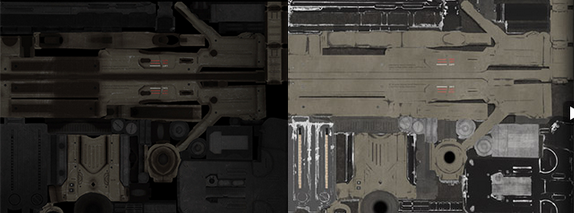
So it is in some sense more correct to use geometric detail instead of texture detail anyway. And most of the time it is simpler to procedurally generate geometry, so!
Miegakure can display more 4D geometric detail now compared to when development started. But there is obviously a similar limit for geometric detail where too much looks noisy.
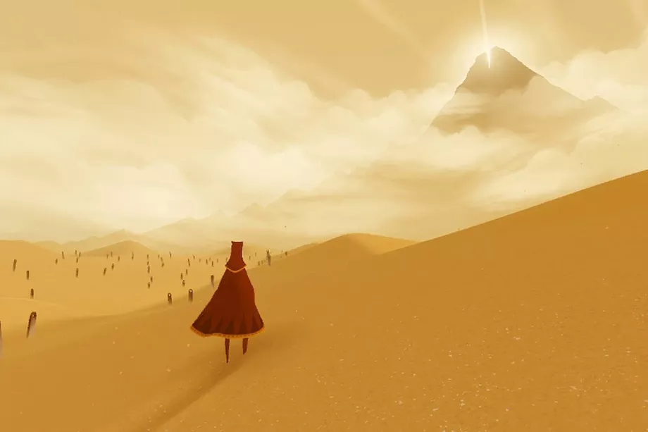
So we can’t have too much texture/geometry detail, but on the other hand I don’t want the game to have very large flat section of colors like so many games have these days. I think it doesn’t work very well with the dioramas seen from far away, where all the visuals are condensed in a small section of the screen. I think it’s fine for the visuals to be simple if they fill a large area like the entire screen, but if they don’t then it does not give enough interesting stuff to look at.
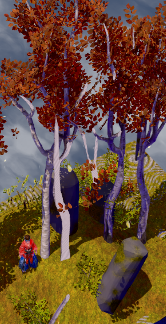
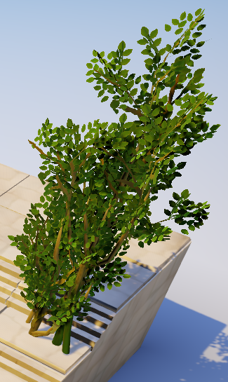
The slicing mechanic also forces upon the game a certain level of realism. For example the tree canopies need to look good when sliced. We could model the canopy with a small number of large flat planes to give a nice painterly/low-noise vibe. This looks good in a regular game, but not when sliced, because the inner structure of the planes is revealed. It just looks like a bunch of simple intersecting planes instead of many tiny leaves creating a canopy. So we need to model leaves more realistically, but we can always make them mostly the same color to reduce noise, as shown here:
So to summarize: we want detail (enough to look good when sliced, and in dioramas, etc…), but not so much that it looks noisy (in the 3D and 4D sense). Compared to texture detail, geometric detail is easier to make and more correct (in the PBR sense and in how it doesn’t require 4D hacks). The final result is a combination of these constraints. It looks much more polished than before. I can’t wait to show it!
